User Info
Overview
The User Info component is responsible for the visual presentation of fundamental user data.
Anatomy
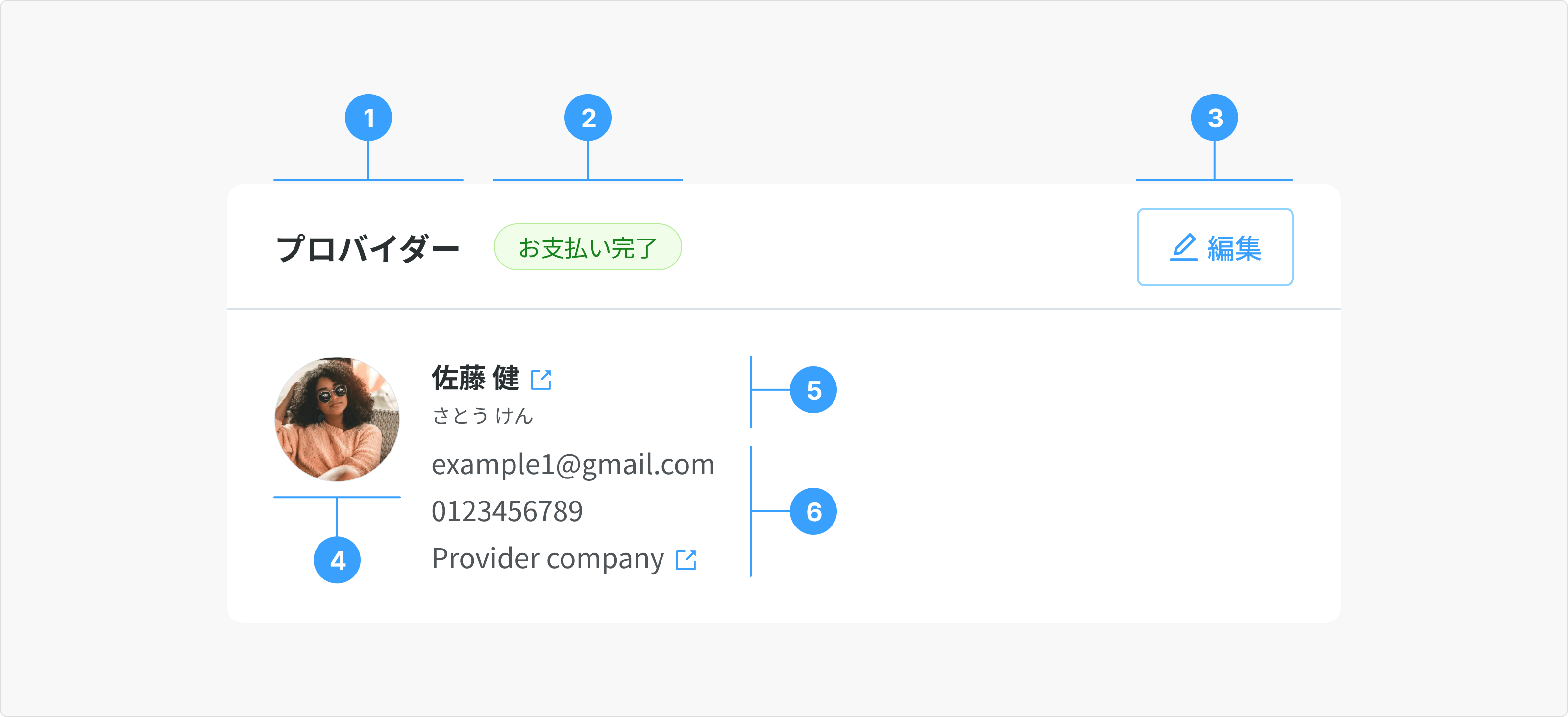
- Card Title: Title of the user card. Two commonly utilized roles in this context are Customer (カスタマー) and Provider (プロバイダー). In certain instances, the Title may be modified to align with specific project requirements.
- Status (Optional): Current status of the user
- Action (Optional): Refers to actions related to the Customer or Provider information associated with the booking. Options include "Change Customer," "Change Provider," or no action.
- Avatar: Profile image for the Customer or Provider. If no image is available, a placeholder avatar will be used.
- Full Name:
- Full Name: Free text for Japanese or Romanized names (e.g.,Tanaka Taro, 佐藤 健). Format: Last_Name + “ “ + First_Name.
- Phonetic of Full Name: Free text for Katakana names (e.g., タナカ タロ, さとう けん)
- Additional Information (Optional): A collection of relevant user details, including email address, phone number, and company name.
Type
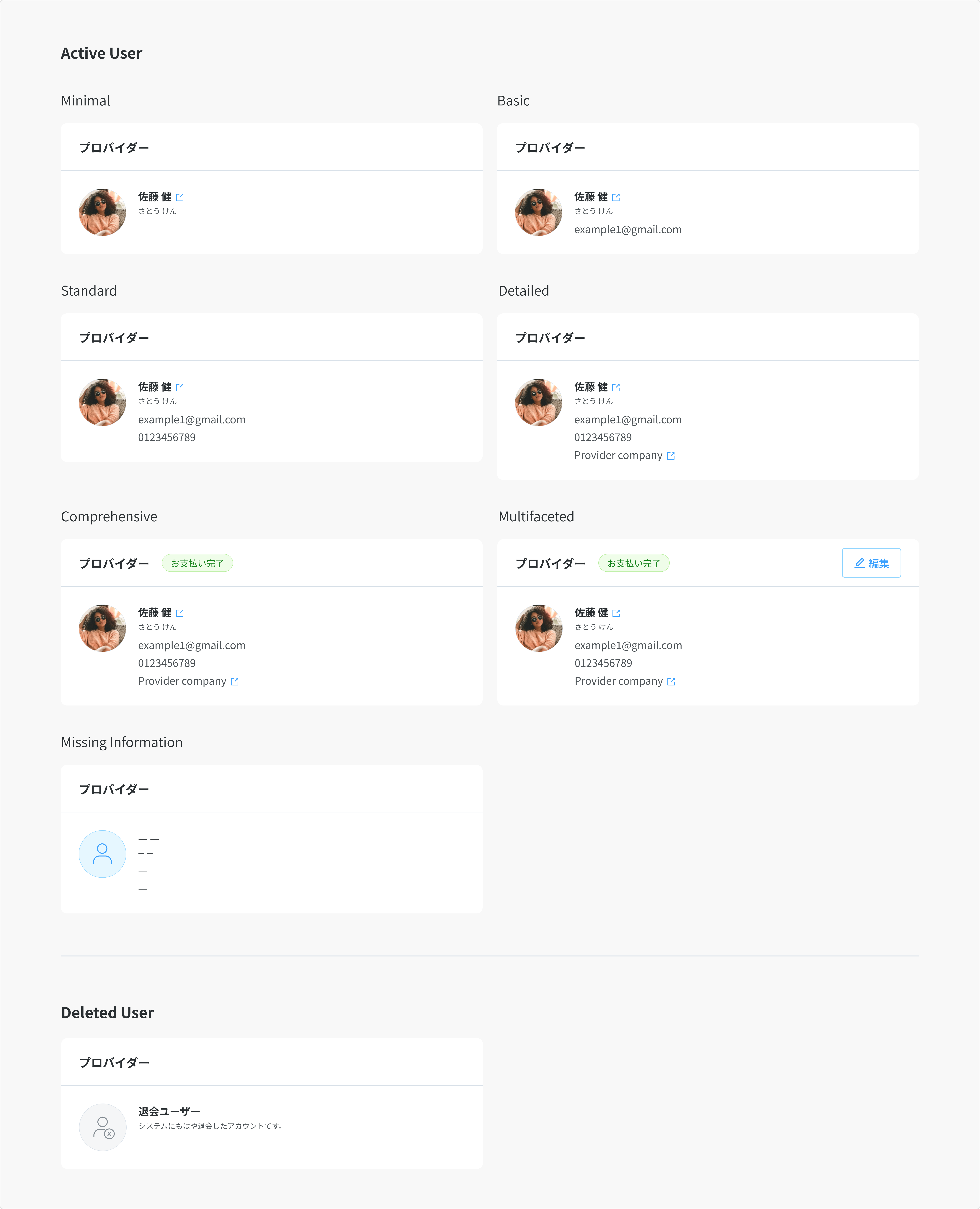
1. Active User:
User accounts exist in the system and are fully populated. We can choose from the layouts below to display information that resonates with business and user needs.
- Minimal: Avatar and Full Name
- Basic: Avatar, Full Name, and Email Address. This is the default layout used in Booking detail page.
- Standard: Avatar, Full Name, Email Address, and Phone Number.
- Detailed: Avatar, Full Name, Email Address, Phone Number, and Company.
- Comprehensive: Avatar, Full Name, Email Address, Phone Number, Company, and Status.
- Multifaceted: Avatar, Full Name, Email Address, Phone Number, Company, Status, and Actions.
- Missing Information: When an optional field lacks information, a dash (—) symbol will be displayed.
2. Deleted User:
A user account that no longer exists in the system.
Usage Guidelines
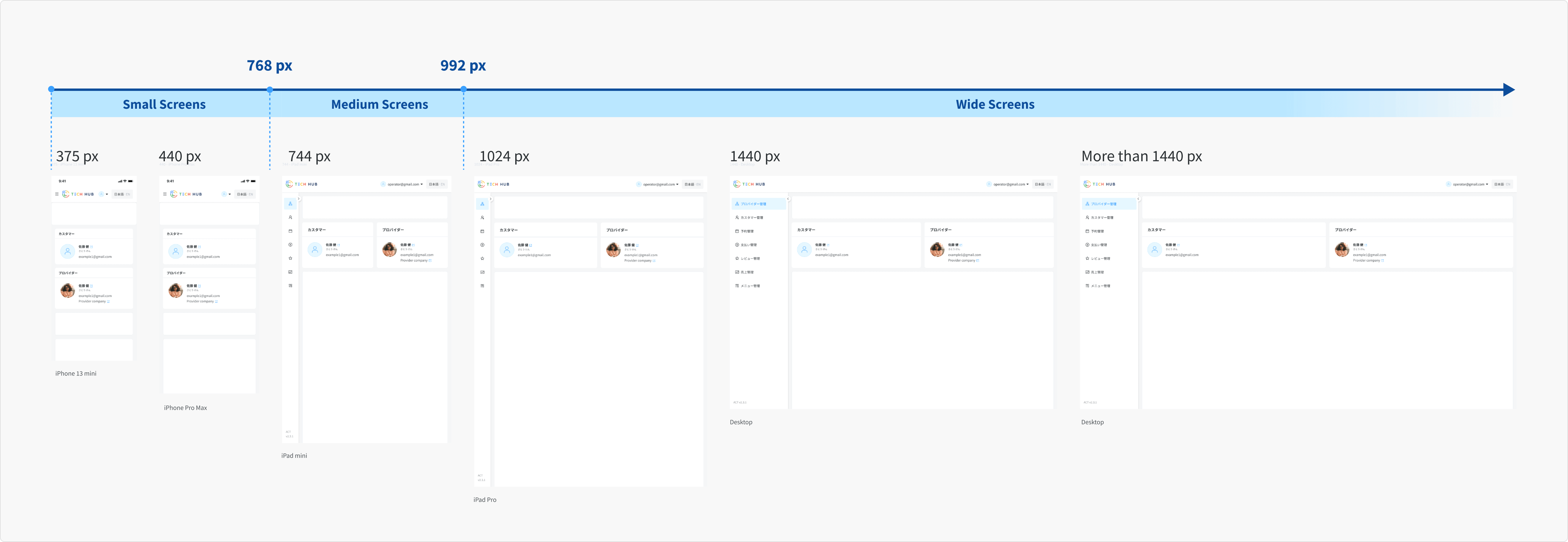
Responsiveness
- Wide Screens (≥ 992px): Customer card and provider card always fill the container.
- Medium Screens (768px - 991px): Customer card and provider card always fill the container.
- Small Screens (< 768px): Customer card fills the container in the first row, while provider card occupies the second row.
- Display order: The Customer card takes priority, appearing on the left horizontally and at the top vertically compared to the Provider card.